I didn’t write this one.
But I think it’s important to give you some background.
Leafly’s old homepage looked (and sounded) like this. Please bear with me, it’s a lengthy scroll.
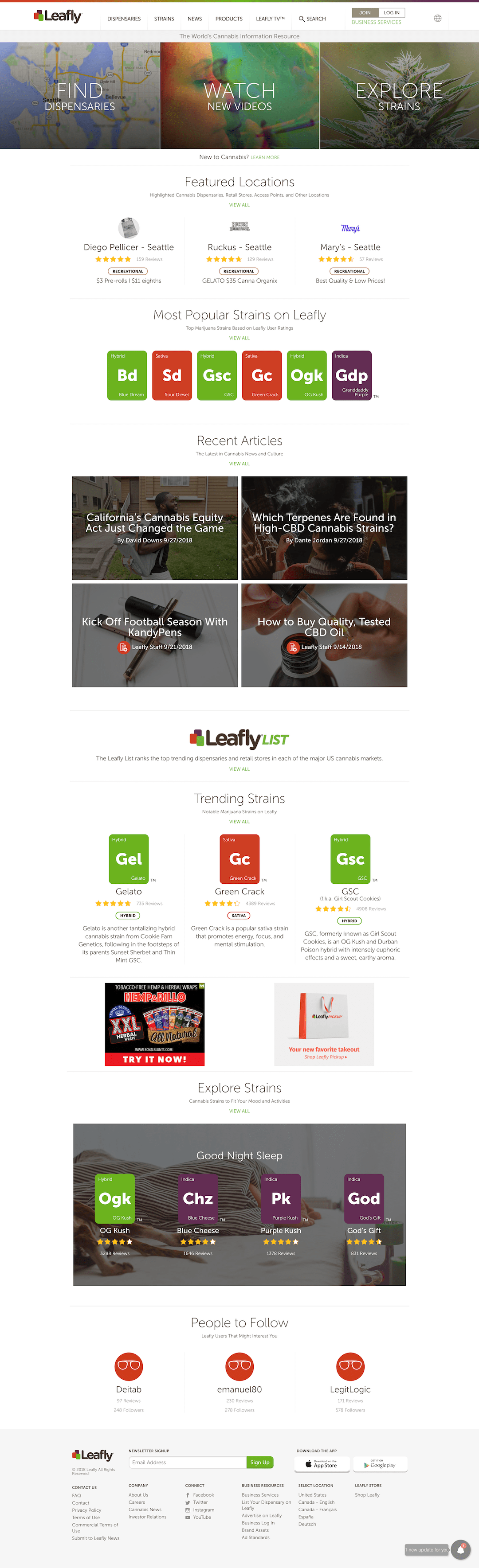
There’s a lot going on there. How did we simplify it while still doing what’s best for the user and for Leafly? Great question!
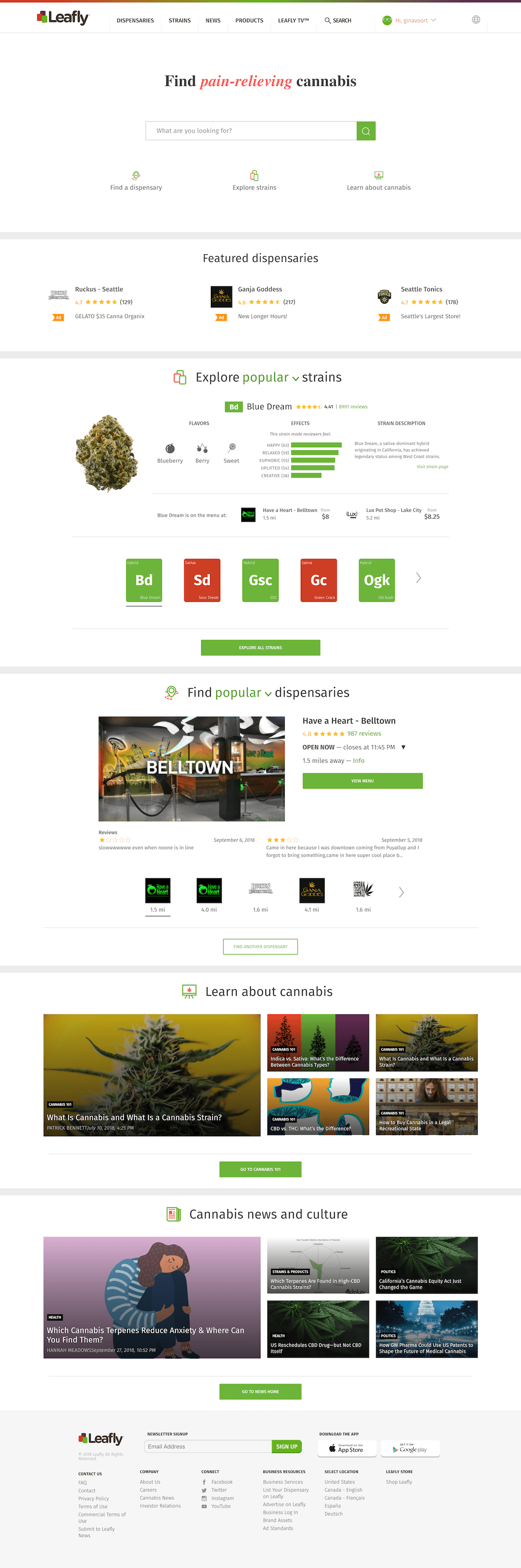
I worked closely with the project’s UX and UI designers to re-organize the content based on user data. We knew that most of Leafly’s visitors are interested in strain information, but we had the business goal of helping more customers down the purchasing funnel. In our case, that meant guiding them to a dispensary page.
In addition to thinking strategically about how information is presented on the page, I also updated the microcopy to match Leafly’s voice and tone guidelines. The CTAs are conversational, helpful, and direct. The text, you’ll notice, has also been dropped down to sentence case.
I wrote this one down here.
Leafly’s new homepage looks (and sounds) like this:
We’ll also be running AB tests to test language and CTA placement. Here’s an example “B” dispensary section.

